
Branding

Branding Basics: A Beginner's Guide to Building a Strong Brand Identity
Learn what branding really means, how visual identity works, and the essential design elements every beginner should understand.
What Is Branding?
Branding is the process of shaping how a business, organization, product, or project is recognized and perceived. It includes much more than creating a logo. Branding brings together visual choices, communication, personality, and the overall experience people associate with a brand.
Think about a brand you recognize immediately. You may remember its colors, logo, typography, packaging, website, photography style, or even the tone used in its messages. These individual details work together to create a recognizable identity.
For graphic designers, branding is especially important because many of the elements people associate with a brand are visual. Designers help translate a brand's personality and purpose into a visual system that can be used consistently across different platforms.
Branding is not just what a business looks like. It is the complete system of visual and communicative choices that helps people recognize and understand it.
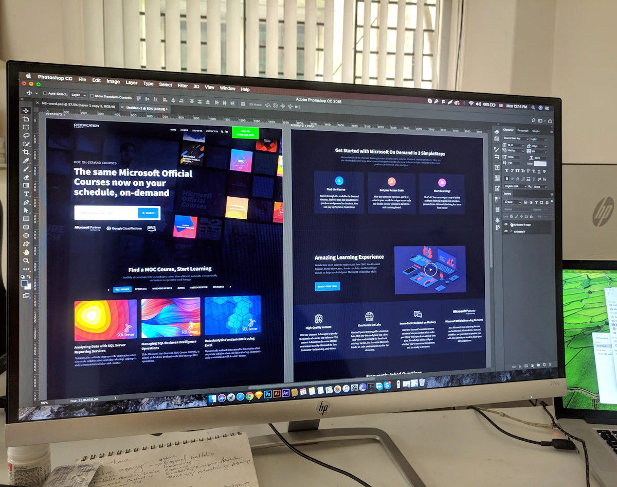
A strong brand identity turns abstract ideas such as personality and values into recognizable visual elements.
Why Branding Matters
A business can have an excellent product or service and still struggle to be remembered if its communication feels inconsistent or unclear. Branding helps create recognition and gives people a visual and emotional reference point.
For designers, branding also provides a framework for making creative decisions. Instead of choosing a color, font, image, or layout simply because it looks attractive, the designer can ask whether the choice supports the brand's personality and audience.
Recognition
Consistent visual elements help people recognize a brand across different touchpoints.
Clarity
A well-defined identity helps communicate what a brand represents and how it wants to be perceived.
Consistency
A clear visual system makes it easier to maintain a coherent appearance across different materials.
Personality
Visual choices can give a brand a distinctive character and help separate it from competitors.
What Is Brand Identity?
Brand identity is the collection of visual and verbal elements a brand uses to represent itself. It is the designed expression of the brand.
A visual identity may include a logo, color palette, typography, imagery, graphic elements, layout rules, icons, patterns, and other visual components.
The important idea is that these elements should not exist independently. They should work together as a system.
Brand Strategy
Defines the brand's purpose, audience, positioning, values, personality, and overall direction.
Visual Identity
Translates the brand strategy into visual elements such as logo, color, typography, imagery, and graphic styles.
Brand Guidelines
Documents how the visual identity should be used so that the brand remains consistent across different applications.
The Essential Elements of Brand Identity
A strong identity is usually built from several connected design elements. Each one has a different role, but they should work together as a unified visual language.
1. Logo
A logo is a recognizable visual mark associated with a brand. It can be an important part of brand identity, but it should not be treated as the entire brand.
2. Color Palette
Brand colors create visual recognition and contribute to the personality of a brand. A carefully selected palette can also establish hierarchy and consistency across different designs.
3. Typography
Typography affects how a brand communicates visually. Font selection, weight, spacing, hierarchy, and usage rules can all contribute to a distinctive identity.
4. Imagery
Photography, illustrations, graphics, and other imagery can establish a recognizable visual direction. A brand may use a particular photographic style, illustration approach, or image treatment.
5. Graphic Elements
Shapes, patterns, icons, lines, textures, and other supporting elements can strengthen a visual identity when they are used consistently.
6. Layout
Layouts determine how brand elements are organized. Consistent spacing, alignment, grids, and hierarchy can make different brand materials feel connected.

A brand identity works as a system where typography, color, imagery and layout support the same visual direction.
The Role of a Logo in Branding
Because logos are highly visible, beginners sometimes assume that creating a logo is the same as creating a brand. It is not.
A logo is one recognizable component of a broader identity system. A successful logo should work alongside the brand's typography, color palette, imagery, and other visual elements.
Do not begin a branding project by asking only, "What should the logo look like?" Start by understanding the brand's purpose, audience, personality, and visual direction.
Color in Branding
Color is one of the most noticeable elements of visual identity. Different color choices can create different visual impressions, which is why selecting brand colors should be intentional.
A branding palette may contain primary brand colors, supporting colors, neutrals, and sometimes accent colors. The palette should provide enough flexibility for websites, social graphics, packaging, presentations, print materials, and other applications.
Good branding does not require using many colors. In many cases, a focused palette is easier to recognize and maintain.
Typography in Branding
Typography gives written communication a visual personality. A modern sans-serif typeface may create a very different impression from an elegant serif or expressive display typeface.
Brand typography should also be practical. A type system needs to work across headings, body text, captions, advertisements, websites, presentations, and other communication materials.
| Typography Choice | Branding Purpose |
|---|---|
| Font Family | Creates visual personality and tone |
| Font Weight | Creates emphasis and hierarchy |
| Font Size | Controls hierarchy and readability |
| Letter Spacing | Influences rhythm and visual character |
| Line Height | Improves readability and structure |
Choose typefaces based on the brand's personality, audience, readability, and practical applications—not simply because a font is currently popular.
Why Brand Consistency Matters
Imagine seeing a company's website using one color palette, its social media using completely different colors, and its printed materials using unrelated fonts. Even if each individual design looks attractive, the overall identity may feel disconnected.
Consistency helps different pieces of communication feel like they belong to the same brand. This does not mean every design needs to look identical. Instead, the same underlying visual rules should guide the work.
- Use the approved brand colors consistently.
- Maintain consistent typography choices.
- Use the logo according to its usage rules.
- Keep imagery aligned with the brand's visual direction.
- Maintain consistent spacing and layout principles.
- Use supporting graphics consistently.
What Are Brand Guidelines?
Brand guidelines are a reference document that explains how a brand identity should be used. They help designers, marketers, content creators, and other team members maintain a consistent visual language.
The exact contents can vary depending on the size and needs of a brand, but a basic guideline document may include logo usage, color values, typography, imagery, graphic elements, spacing, and examples of correct and incorrect usage.
Logo Guidelines
Show approved logo versions, minimum size, spacing requirements, and examples of incorrect usage.
Color Guidelines
Define primary, secondary, accent, and neutral colors along with their digital or print color values.
Typography Guidelines
Explain which fonts should be used for headings, body copy, captions, and other communication.
Visual Style
Describe the preferred photography, illustration, icons, patterns, layouts, and supporting graphics.
Common Branding Mistakes Beginners Should Avoid
Trying to Make Everything Trendy
Design trends can provide inspiration, but building an identity entirely around a temporary trend can make it less distinctive or less relevant over time.
Using Too Many Fonts
Combining too many typefaces can make a visual identity feel inconsistent. A carefully selected type system is usually easier to manage.
Choosing Colors Without Purpose
A color should support the brand's visual direction and practical needs. Random color selection can make an identity difficult to use consistently.
Focusing Only on the Logo
A logo cannot communicate everything about a brand. The broader identity system is what creates a consistent visual experience.
Ignoring the Audience
A design may look attractive to the designer but still fail to communicate effectively with the intended audience. Branding decisions should always consider who the brand is trying to reach.
8 Practical Branding Tips for Beginner Designers
Understand the brand before designing
Learn about the brand's purpose, audience, personality, values, and goals before making visual decisions.
Create a visual direction first
Develop a moodboard or visual reference collection to explore possible colors, typography, imagery, shapes, and overall style.
Keep the identity focused
A smaller number of carefully selected visual elements can create a stronger and more recognizable system.
Design for different applications
Think beyond a single logo presentation. Consider websites, social media, print, packaging, presentations, and other real-world applications.
Build a typography system
Decide how headings, subheadings, body text, captions, and other text should work together.
Test the color palette
Check whether the selected colors work together and remain readable across different backgrounds and applications.
Create simple brand guidelines
Document the essential rules so that the identity can remain consistent as more designs are created.
Think in systems, not individual designs
The goal of branding is to create a visual system that can produce many consistent designs rather than one beautiful graphic.
Final Thoughts
Branding is much more than designing a memorable logo. It is about creating a connected visual and communication system that helps people recognize, understand, and remember a brand.
For beginner graphic designers, the most important lesson is to think beyond individual graphics. Color, typography, imagery, layout, logos, and supporting elements should work together rather than exist as unrelated choices.
Start by understanding the brand. Then build a visual direction, create a consistent identity system, and test how that system works across different applications.
Creative Mind Journal Takeaway:
Great branding happens when strategy and visual creativity work together. A strong identity is not simply beautiful—it is recognizable, purposeful, consistent, and designed to communicate.
No comments